
I started Postcardwall back in 2009 simply to explore artworks through exhibition postcards. And I’m now celebrating reaching 365 postcards “on the wall” by exhibiting parts of the collection in interesting spaces across the country.
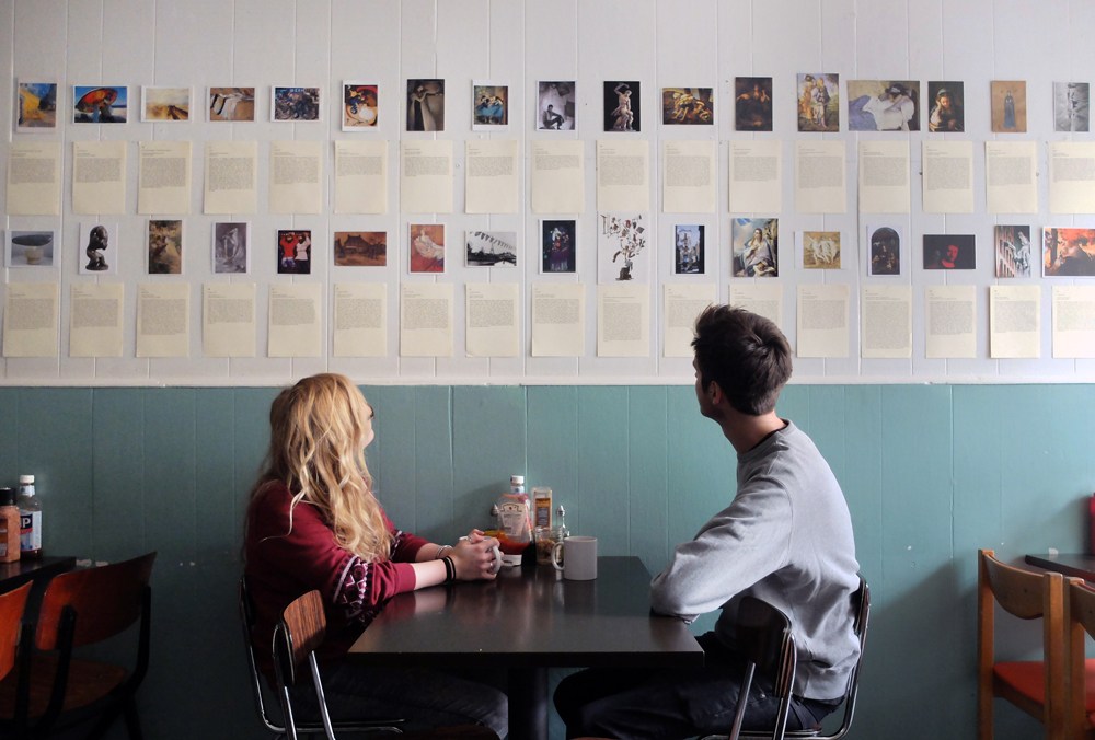
Previously only shown in number order, this is the first time the works have been seen grouped by theme. From this week at Mario’s – a Kentish Town café with links back to the 1950s, when the family emigrated from Italy – the display of postcards explore native style and the artist as a traveller for art’s sake, paying homage to the café’s history.
The first rows of postcards are dedicated to Italian artists, surrounded by those who travelled to Italy to study with the Roman, Venetian or Florentine schools. Next there is a selection of postcard artists that visited or lived in Paris, reflecting that teeming period in history when artists, both French or otherwise, gathered at this hub of creativity and experimentation. The opposite wall is an eclectic mix of artists from history to the present day, the works exploring space and place, often as a way for the artist to connect with their surroundings or identity.
Every postcard is accompanied by its explorative text as on my blog, which acts as a window, helping us to delve further into each work of art. Here are three of my favourites:
1. Il Ritorno di Giuditta a Betulia 1470-72 by Alessandro Filipepi Sandro Botticelli, Uffizi, Florence
 Out of the many Italian wonders in the Uffizi, this small painting is hardly one of the most famous. Small, it is inconspicuous in the centre of its often crowded room, yet it intrigues, if only for its author whose larger and more infamous paintings hang throughout the gallery. Even without knowing that this is a Botticelli, his stylistic signatures are evident throughout the painting. The serenity of Judith’s face summons that of Spring’s: calmly flat and oval, it is pale and statue-still. As the figure of Spring epitomised La Primavera, here Judith epitomises her triumph over Holofernes. She is un-brutal, placid even, yet beautifully in command: crowned, her hair curls in golden ringlets; stepping forward she is assertively in control, holding her weapon, lethal though it is, as an adornment of her command. Silvery it curves to a delicate point, picking up the translucence of the slippery folds of her gown, billowing as they ripple in the breeze. Likewise, her maid determinedly looks forward, clutching her skirts, her scarves also caught in the wind, ironically mirroring those of Holofernes’ head. This movement drives both figures forward, captured as they are on their mission back to Betulia. The surprising calmness of Judith’s attitude towards the task in hand is reflected in the colours Botticelli uses; the subtlety of the blues and greens dilute to a wash in the background that mirrors the serenity of its protagonists . Far from the myth of Spring where dark and fantastically vibrant colours dominate, here Boticelli adopts a peaceful backdrop for Judith’s courageous act.
Birthday 1915 by Marc Chagall, MoMA, NYC
 Marc Chagall was a pioneer of Modernism. Though Russian, like many artists of that period he was later known as French, due to his living among the many others in Paris. He was by no means limited to painting and worked in a variety of different mediums, infamous perhaps for his stained glass windows that stand across the world, from the UK to Jerusalem. The painting Birthday shows his original style beautifully, the fantasy of his whimsical figures that seem to float through his compositions on a breeze of their emotion. Far from ghost-like, they are full of life, floating only in exaltation, much like Klimt’s figures in his compositions. The woman gazes upward, her face illuminated in light from the window; eyes wide, she appears on the brink of accent. The man, meanwhile, is above ground already; off the floor in strength of feeling, he curls round to kiss her in what should be a painful motion but appears calm, a twist and effort of love only – the figures appear entwined. The intensity of this emotion is reflected in the vibrancy of the floor, which glows red, the whole room picking passion up in Chagall’s characteristically coloured compositions. There is wonderful detail throughout the room, in the various fabrics’ patterns and the painting that hangs on the wall; this and the curious perspective opens the room out before us, rather like an illustration, the painting becomes comfortingly story-like. The warmth of the room is in contrast to the view of the street outside, which seems to be deliberately brought to our attention. There is an outside world, but currently these two are not part of it, so intimate do we find them in their exchange of celebration.
My City – part 2 ‘Heterotopia’
2014 by Yunsun Jung, Vyner Street Gallery
 Jung’s series ‘My City’ uses cardboard to constructs explosive and energetic installations, a sharp twist on the usual masses of the stuff we see spilling out of our recycling bins. Of course the material is deliberate, copious amounts of cardboard representing our endless appetite for things; it is the packaging of our material world. In its cycle of use, re-use and recycling, Jung builds her city from a body that, like the city itself, is constantly being reborn. Jung’s cardboard is far from the crumpled on the recycling pile, but beautifully cut and manipulated into a series of perfect shapes. Their careful execution adds to their poignancy – these crisp edges and smooth surfaces could be crushed. Indeed, they take the shape of all that is fleeting as Jung moves from place to place, from city to city. These are the shapes that amass our lives through each metropolis: some are recognisable – a plane, a humorous spider; some are not, as giant zig-zags and curves erupt with unkempt and questioning energy. The word ‘Sainsbury’s’ slides pathetically along the floor, defeated by the boxes that package its consumer goods. Colour intermittently distracts from the overwhelming and ironically earthy brown in seemingly random and non-sensical objects; a large jagged cardboard arm leads to a sad, abandoned pile of clothes. Jung’s installation is powerful because it manages to express a frustration we all feel, an explosion of stuff and rubbish in an ever-expanding world.
Postcards at Mario’s runs from 12 Jan – 18 Feb 2015, Mario’s Café, 6 Kelly Street NW1 8PH. Open Mon – Sat, 7.30am – 4pm. Admission free